Tuesday, May 4, 2010
Reflection
After being at the critiques, and presenting my own work, I can honestly say that overall I have learned that talking to the board is not acceptable. As I was presenting my board, I was nervous and trying not to just have a conversation with my board. As I was up there I could have taken more time explaining the materials and the floor plan. Another thing is that board layout is important. If a client is not able to understand it from a distance then something is wrong. There were some boards that I did consider to have a great layout, and maybe I could improve my layout organization for future presentations. I also saw presentations that did a good job presenting their work and ideas and were very organized, something that I personally have to work on. From my own presentation, I have to work on how I present my materials and how they will be used.
Proposed Space for Loading Dock
The designer I had in mind for this space is Phillip K. Smith III. However this space could be inhabited by any other designer/artist. I wanted the design to be flexible for any person who visits.

 Both are sketchup renderings of the bedroom and the entrance to the studio space.
 For the Studio space I wanted to have the public entrance and a sliding door so that the artist can bring in taller supplies. For the studio space I wanted to give them a place to assemble their designs, I wanted it to be very versatile and open.
 For the kitchen I wanted to keep it very simple. The bar can be used as a table, I figured since it is to be a temporary space, the artist would not need to have a full dinning table.

The bedroom is beside the bathroom and kitchen, it is enclosed with transparent panels, I wanted the bedroom to be enclosed without having walls to completely shut it out.
 South Elevation
 West Elevation
 The floor plan is very open can be changed according to the needs of the artist visiting.
 East Elevation

North Elevation

 Both are sketchup renderings of the bedroom and the entrance to the studio space.
 For the Studio space I wanted to have the public entrance and a sliding door so that the artist can bring in taller supplies. For the studio space I wanted to give them a place to assemble their designs, I wanted it to be very versatile and open.
 For the kitchen I wanted to keep it very simple. The bar can be used as a table, I figured since it is to be a temporary space, the artist would not need to have a full dinning table.
The bedroom is beside the bathroom and kitchen, it is enclosed with transparent panels, I wanted the bedroom to be enclosed without having walls to completely shut it out.
 South Elevation
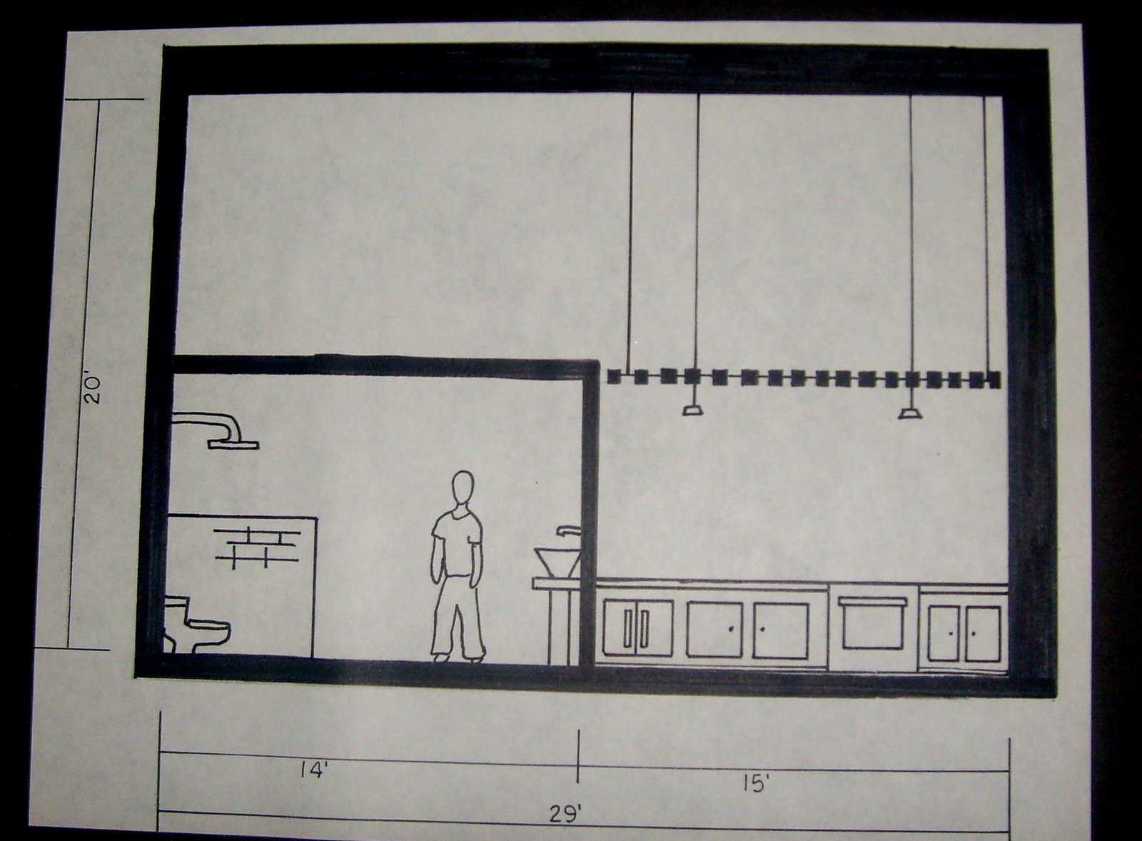 West Elevation
 The floor plan is very open can be changed according to the needs of the artist visiting.
 East Elevation
North Elevation
The elevations show the ceiling changes, from being lower in the kitchen, then increases by the bedroom then the studio space. This way each space is divided by the ceiling changes.

The materials thought to be used is white oak wood for the furnishings, and wooden beams in the ceiling. Stainless steel would be used for the counter tops. The green color would be used for the bedroom and kitchen area, while the blue would be used for the bathroom. The studio area would have an off-white color.

The materials thought to be used is white oak wood for the furnishings, and wooden beams in the ceiling. Stainless steel would be used for the counter tops. The green color would be used for the bedroom and kitchen area, while the blue would be used for the bathroom. The studio area would have an off-white color.
From Living in Color to Trading Spaces

This one point perspective is of a 12ft by 12ft space. I used white pencil pastel on the left, then marker, then water color and finally colored pencil.

The media I used for this perspective is watercolor. I wanted to incorporate some sense of nature in an urban environment. The blue line on the elevated floor is water flowing throughout the space, which starts from the stone wall on the left. The layered panels has recessed lights that have the repeated shape of the line on the ceiling.

Sunday, May 2, 2010
process of redesigning the loading dock
So the space I had to redesign was the loading dock. At first I had the intention of having a loft raised about 10ft. Still with the concept of using concrete as the main material throughout the space, even the loft. The furnishings would be out of white oak wood, and would be highly contrasted with the concrete.
 The bedroom, or loft would be accessible by stairs. But in order to actually do this, the air vualts would have to be removed.
 For the studio space I wanted it to be very open. I wanted the privite entrence to be near the studio, and changing the garage door into windows.
 The kitchen would be very simple, but in this perspective I just focused on the eating area which is like a bar, I figured that the artist/designer, would not need a full dinning room, just some place to place their plate at.
 At first I wanted the office space to be under the loft and near the bathroom, with a built in table, suspended by wire. The office space would be mostly used to sketchup different designs.
 The bathroom I was mostly focused on how the shower was going to be placed, the shower was to be open and just covered by glass brick and tile for part of the wall, the floor would still be concrete.
 This is another perspective of the office space.
 Another perspective of the kitchen area.
 I wanted to change the garage door that was in the loading dock to windows. But then it I wanted it to be slidding door panels to be used as a public entrence. The private entrence would be the wooden doors that were already in the space, near the office space.


 For the loft, I played around with different color schemes, since at this stage , the only color I wanted to use was for the bedroom. Something about this whole design still did not convince me.
 I choose this precedent image becuse of its vast open studio space.
Looking back at my precedent images and some of the begining perspective, I did not like anything about it. At the last moment I ended up changing it.
Subscribe to:
Comments (Atom)