Sunday, February 5, 2012

Assignment 5

After the visit at Freelon, and listening to a representative from TVS design, it has become clear that both architects and interior designers work together to  design an environment. Taking in what was mentioned, both firms have clarified the misconception of what it is to work for a design firm. It is a team effort, and not just one person telling others what to do. It is a check and balance between both architects and interior designers.
The only difference between both firms is the style of projects, and the main reason for it all is the clientele and the market that they are trying to design for. TVS design, is more upscale, and has a “wow” factor. From what I  gathered from the presentation is that they do a lot of commercial work, mostly in retail design. They take a concept and allow that to drive the design. This method to me seems like it works for them, especially in the line of work that they do. However, as a student, I am still in the process of understanding the idea of having a concept word, or phrase, and allowing that to be the inspiration for my design. 
Freelon also focuses on commercial, but their style is more of a refined, clean-lined work. Their aesthetics seemed detail oriented, not saying that there was no “wow” factor, it was just in a different way. Both firms have different ways of representing their work, and each works well for the market that they are going after. As a student looking forward to working in the real world, I can honestly say that it is all about being able to communicate your idea to other designers. Not only that, but it is a very fast paced environment, and depending on the scale of a project, one would be multi-tasking. I think that, the fast paced environment might be a challenge for that transition from student to worker. 

Sunday, December 11, 2011

Saturday, December 10, 2011

Sketch Series 5 and 5.5


sketch series 1


This is a study of light zones on the third floor in the Gatewood Arts Building. The orange is daylight recorded at 3pm. As you can tell I was only able to record the studio area. The green is the electrical light that was recorded at 10 pm and every single light was turned on. 

Sketch Series 4: Luminaire


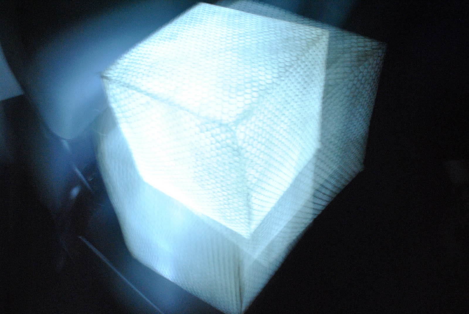
The concept behind this is voxels, a 3 dimensional cube that makes up a space. The environment that this Luminaire would be placed in is a 12'x12'x12' space. The Idea is that the volumetric size of the "luminaire" would fill up the whole space.  However only one of the 144 cubes would actually be highlighted by light. It is to be not only a focal point, but provide a claim environment with it's glow.  Ideally it would be suspended and placed in the center for people to interact with it, visually at least.

Wednesday, September 28, 2011

sketch series 3


Using a light meter, we as group, measured the lighting levels of the second floor lounge. From there the same levels were connected with a different color for each number that repeated.

 Then the reflectance of each surface was taken.

sketch series 2


-Incandescent lamp, studio work space, task lighting, warm tone
-MR-16, pin up space, spot lighting, warm tone
-Fluorescent, hallway circulation, ambient lighting, warm tone
-LED, pocket lighting, sparkles of light, cool tone

Incandescent lamp has a warm tone of light which suggests an impression of anxiety. The MR-16  is a purposeful lamp which provides direct spotlight and makes it difficult to work underneath.  Fluorescent lighting provides more of ambient lighting, its warm glow provides a visual clarity. The LED which is the cooler color tone shows lower luminance levels by itself, however if it was set up with more than just one of these LED’s  it would create a sense of enchantment. With incandescent lighting does provide harsh lighting and may cause anxiety, however it does a good job at providing enough light to complete different tasks. MR-16, just used to spotlight an area maybe if it was a consistent distance and adjusted to direct the light at the wall it would improve the lighting quality. The LED is just to provide a sparkle of light, if it had more LED it would serve more of a meaningful purpose for the space but for the size that it is and the luminescence that it gives it works fine for little moments of light. 

Friday, December 10, 2010

Machine


For Machine I did this simple stacking effect of the Fransworth House interior, with a scale figure cut out of chipboard.

Perspective


For perspective I did a rendering of the Trevi Fountain, an artifact, and of course it was a 2d. I gave it more of a cartoon effect because of it's theatrical nature. 

Clock


For clock I decided to do place, which was London, and paragraph.

Point: Explorations


The ripples of water is how I see design, everything done is connected to one another.  This in design is the basis of how we embrace the design world. How everything influences one another in some way. Throughout the exploration unit and the course of the semester we explored the notion of the design process and how it is  constantly changing through the course of time in order to find a voice. 
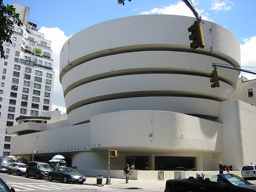
During this unit  most of the buildings and spaces were criticized for not being meant for humans to function in. An example of an interior not being suitable for a human is the Farnsworth House by Mies van der Rohe. This glass rectangle does have a certain glamor to it visually and the idea behind it must have been a good one, but once a person walks in one a summer day, its like they are baking in the oven. Another example is the Guggenheim museum by Frank Lloyd Wright, a modern building that breaks the rules by forcing the person to walk in a spiral ramp to view the different exhibits found inside. The idea of it sounds too good to be true and it is, the shape of it being circular is difficult for large scaled paintings to be hung up on the wall. Modernism has lost its roots of designing for the human being that will inhabiting it.
One question that was asked in my first year of IARC was “who are you designing for?” at first I was thinking that it was a rhetorical question  because there is only one reason for why we as designers would be designing for and that is the person who would be using it. This question again started haunting me as the end of this semester came to a near. Reviewing everything we have learned in this course and how the design cycle has changed throughout time, I feel that the design at first in earlier times, was to help people live comfortable and was more about substance. Now looking at different Modern buildings, design became about the aesthetics and no longer followed function.
The foundation of it all has changed from being focused on humans to just being focused on the aesthetics. There is no substance in design anymore, there is only surface.  It is as if the origins of it all has not been able to be traced back on current design. The classical language of Doric, Ionic, and Corinthian columns are now long gone from our new modern designs. The old buildings with classical language still have a lot of contrast with new ones being built. The modernistic movement is the alternative of this classical foundation. Like the ripples of water, design now a days is hard to pinpoint its origin. Even though we may not see many classical buildings, they were the start of this modern designs. Without this foundation there would not be anything to go against. But one thing that still remains unanswered is “Who are we designing for?”, this question should be the first thing that every designer should ask themselves before they decided to go for surface over substance. 

Wednesday, December 1, 2010

Reading Comp. 7

The diagram above is of the Roof Carpenter by John Sloan shows the emphasis of labor in that time. The drawing of it emphasis’ the actual carpenter. The contrast between the line weights is what makes the carpenter stand out from the paper. The drawing of the man working is overall centered on the paper, however the carpenter is off centered on an axis to depict movement. The line weights also provide a balance throughout the whole composition of the work, between the lightweight lines to show the context and detail, the bold lines of the man, and the dark small shadow that is underneath the man. The ever-going lines of the context create this unity between the drawing the paper.  The graphite also relates to the type of work that this man was doing.
Focusing on the work and commerce theme in the Greensboro Collects Art gallery exhibition at the Weatherspoon Art Museum, all of the pieces have people in their work setting describing the ambience of what their work consists of. “The dawning century was to be the era of the machine, of greater speed, and of unprecedented mobility, and the architecture of the new epoch would surely proclaim this mechanization.” (Roth pg. 519-520) Roth explains that this is a time were the machine was to take over the work area to create these structures.  However, John Sloan’s Roof Carpenter contrasts everything that Roth explains, his art depicts the carpenter being the “machine” for lack of a better word, working his way to construct this roof. Another art piece that portrays man as the machine is Willie Cole’s Knapp Monarch, this sculpture of this “iron man” sitting on top of this wooden base clearly shows that even before the common definition of what machine is, the human body was and is the machine. “The ‘Hi-Tech’ movement celebrated the aesthetic of industrial production,”.(Massey pg.195) Massey also describes this industrial definition of what was current during that time, but Sloan’s artwork seems to still celebrate the old ways before that of industrial production in contrast to the sculpture which celebrates man as the machine, literally.  Both art works display different views on consumerism. “Consumerism and the emerging global economy become more important.” (Harwood pg. 805) Sloan shows that in order to survive in this commerce world one must work, the facial expression on the man clearly defines hard labor. Cole gives us this iron man made out of irons that show what is available for people to purchase at their own will and become what they consume, a machine.  In all I believe that the overall theme for work and commerce is the human body becoming the machine in order to work and survive this commerce world.

Wednesday, November 17, 2010

Reading Comprehension 6

1. Art Nouveau was a conscious attempt to reject historic styles. However, it was greatly influenced by fine art, non-western cultures, and not to mention past styles. The building and interiors became works of art, sculptures that captured the essence of movement in design. They strive for unity in design to create complete expressions, or what they call total works of art, (Harwood pg. 485). They created more than just a visual connection but also the emotional connection with the beholder just like the artists in that time period.

Antonio Gaudi’s Casa Batllo is an example of Art Nouveau’s organic sculptural piece. Gaudi was influenced by Moorish ceramic tiles and this shows in the façade of the building its glass pieces embedded in the concrete. Its surrealistic form resembles something that Salvador Dali would have painted. I guess Spain is responsible for giving the world surrealists. Another possible influence is the baroque style, because of its dynamic mass.
Victor Horta’s Stair Hall at Hotel Tassel gives a different artistic view of what was done. The whiplash lines that become the decoration moves your eyes in the direction in which you should try to navigate the space. This interior seems like it has traces back to the rococo style, its tendrils overtaken over the interior.
Both also have the influence and inspiration of nature embraced in the interior as well as the exterior.
"I disgard the flower and the leaf but I keep the stalk."-Victor Horta


Casa Batllo, Antonio Gaudi (Harwood pg.497)

Hotel Tassel, Victor Horta (Harwood pg.500)

2. Simplistic does not come easily, Le Corbusier and Pierre Jeannert ‘s Hall in the Pavillon de l’Esprit Nouveau choose function over aesthetics. This example of the modern movement demonstrates how the home should be like a machine; having a specific function, in this case a place where people live. Space became important; therefore anything that was unnecessary was removed. Volume also became of importance by having high ceilings and different ceiling level changes. Decoration became minimal, there were no ornamentations on the walls only white walls with maybe an adjacent color of either warm or cool hue, therefore letting the light illuminate the interior. In this case the walls are white and the painting hung became this simple decoration on the walls. They clearly designed on the concept of less is more, but is that true for this time period? With the media advertising different nick-knacks and novelties we tend to revert back to the Victorian age where our interiors are filled with useless clutter. We become hoarders that seek, more like desire, more space. It is clear that even with the this example of a modern interior, it is hard to relate to it because it seems to be cold and “too clean” for use to picture this to be inhabitable.
Hall, Pavillon de l'Esprit Nouveau, Exposition des Arts Decoratifs et Industriels (Harwood pg.629)


3.
lecture hall, Viipuri Library, Alvar Aalto (Massey pg.86)

Thursday, November 11, 2010

Reflections Summary


All three uniformly discuss this concept of revolution. Nathan talks about the industrial revolution which made many designs in that time possible. Alyssa writes about the revolution of time and how designers revive the past to work out the kinks and improve the designs. Caitlyn questions what starts a revolution, what pushes the envelope that starts this change in design. Overall all three focus on the most important revolution, the design revolution. It is the concept of taking the old ( ornamentation, furniture, exotic influences) and recreating them into something new.
Caitlyn's blog post image

Caitlyn's image is of the rubix cube that symbolizes this notion of mixing and getting different design voices in one "cube".
Nathan's blog post image

Nathan's image is of the Eiffel tower which was not made possible if it were not through the industrial revolution.


Alternatives Summary


All three of my peers took alternate routes in describing this unit, but had somewhat of the same concept, rules were broken during the Baroque period. Jenni  mentions  that most of the explorations were just fads that did not last long, and reverted back to the classical language. Katherine incorporated geometry to tie in both the classical world and the baroque style, both having contrast by the shapes being used in each period. Nicole describes this as time when people broke the rules and made a mark in time. It is interesting to see how each person came to the conclusion that in order to break the rules you must understand them, and that in the end it only lasts for a little while.
Katherine's blog post image


Monday, November 8, 2010

point: Reflection

In the reflections unit we have covered the Victorian time period. During this time many styles have overcrowded its interiors. Machines and new materials are now being introduced to the design world creating new building structures with new purposes.
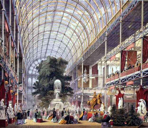
The crystal palace is constructed from the new materials that were introduced in this time, iron and glass. It is the setting for the exhibition of the world’s fair of 1851 where many designs are shown in this place. It becomes a container for what the design world has to offer. It is containing the past designs in this modern design.  The great exhibition demistrated the world’s influence on design, it was providing the world inside a glass bottle. The exhibition itself represented the eclecticism of the Victorian time period.  Many people were now able to see what the world has to offer through this exhibition, and now wanted to have different things in their home. Now the interiors were now being cluttered with all these artifacts to represent the owner’s understanding of world.
            The crystal palace itself did not correspond to what was inside, like many buildings during its time the interiors did not match what the exteriors had on its façade. Many people had different opinions about what should be the dominate influence in design. Everything in this time period reflected what was being questioned, what style should be used. Mostly because no one knew the right answer, therefore many interiors were crammed with different patterns and textures that made everything look busy and difficult to pinpoint one style. “Everything Goes” became the concept of these hodge podge interiors. During this time as well the trade routes opened up to Japan and China, adding more influences to the design world. It was a time period of testing new things and exhibiting different cultural influences.  Everything that was being created was its own riff of what other cultures and previous stylistic period had done before. They were trying to connect with the past and other worlds, which changed the connotation of the whole things they were trying to revive.  
            In a way homes and the crystal palace became like modern museums of the time, especially the crystal palace.  You can compare the crystal palace to the Guggenheim museum in New York. Both showcasing different styles under one roof that does not seem to be housing these styles. Like the crystal palace the Guggenheim was very modern for its time and open to allow its artifacts to be the main focus. The Crystal Palace like the Guggenheim was a very interesting container that became its own artifact of modernism in its own time period. Leading the way to innovative use of materials, and space. As you walk in a spiral to see the revolution art in the Guggenheim, the Crystal Palace used its exhibitions to showcase the revolution of design and what the world had to offer.  Just like art, people had their own interpretation of what should have been revived, designed and also shown in their interiors at the time.  


Guggenheim Museum
Crystal Palace 


Wednesday, November 3, 2010

Reading Comp. 5

1.) The image above is my rendering of the papier-mache chair found on page 26 of the 19th Century Harwood book, image 1-41. This chair symbolizes the revolution of a new material for a chair. Using papier-mache to add delicate detailing to the face of the chair. In that time period people supported the  idea of new materials being used and this is an example of what people supported. This material was molded on top of a metal frame, in this case the chair, then it was lacquered in black. 


2.) The eastern world has influenced the western world at many scales in which people interact with. 

The Royal Pavilion 
The Royal Pavilion is an example of how the middle eastern world, has influenced the exterior of this building. The exotic appearance can be connected back to Islamic roots.  The center dome being Ogival and having Minaret at its side resembles a mosque. It is interesting to see how before the "mosque" building form was a important gathering place, and the Royal Pavilion became this important gathering space that at first was intended as a retreat.
The artifact above shows the Japanese influence in the western world, in this case Paris, France.  The french word Japonisme, describes the influence of the japanese art had on the artifacts. They took the concepts of combining the art with their storage unit.  Using the same technique known as lacquerwork, a black background with flower motifs in gold, and covering the storage unit.
Long Gallery, Brighton Pavilion
The Long Gallery space in the Royal Pavilion shows signs of Chinese influence, known as chinoiserie. The flower motifs that where once used in porcelain ceramics are now being used to cover the wall. The imitation of these motifs are made differently then those used in china. The ornamentation is more vivid in color and a light palette.

Chinese House (Potsdam)

The Chinese House symbolizes the place in time when all these exotic influences started appearing in the setting.  This one for example is a chinoiserie influenced.  Usually the setting of the building if they where private in china would be surrounded by gardens, this house not entirely private is still surrounded by nature. In this time period many ideas have blossomed on how artifacts, spaces and building are designed and reflect the cultural knowledge of people that own/create them.  They take the concepts and transform them into their own interpretation and language they want it to speak. 


Tuesday, November 2, 2010

Map


For the word I chose the House of Vetti in Pompeii, Italy. The word "experience" is at a gradation from light to dark, which is what the house of vetti is known for its passage of having a humble entrence to this light which is filled from the atrium.  Descrabing light as nature, and the experience which people have in the house.
   For the paragraph I did the Redwood Library.
For 2-D I went with the Rhode Island State House, just alligned in four parts mimicking the staircase.


 For 3-D I did a simple pop-up of the Haus Am Horn in Germany.

Saturday, October 23, 2010

Point Alternatives


   Bending the rules or breaking them to work for their own advantage? This question comes to mind when I ponder about what the alternative unit was about. The two stylistic periods that are bending and breaking the rules are those of the renaissance and baroque.
   The renaissance is known for the revival of the classic, making man the measurer of all things again. The only difference was that no building looked the same as any other. All the buildings have the same things in common, the unity or harmony with the architectural details through repetition, the geometric patterning and the separation of spaces that are found by boundaries, edges, and borders. The main goal was to cram everything they knew, into one building and it was mostly in the facade. It created a contradiction of the importance of the classical language that once had significance, into just something ordinary. For example Palladio’s Villa Capra, the once public sphere that was commonly visited in the Pantheon, now becomes a private sphere inside this villa. The importance of the dome has changed its meaning to fit Palladio’s design. The renaissance took the rules and pasted them like a collage.
   Baroque is basically known as a pretentious style period. It took the boundaries that were once used in the renaissance and expanded it until it broke out into the world. It was about intensifying everything they knew and creating a theatrical setting to provide some sort of experience for the viewer. Geometric shapes are now being used in a different way, changing the circle to an ellipse and a square into a diamond to create the sense of movement and making that the emphasis. The classical detailing is used to create movement and proportions and scale are forgotten to emphasis what the designer thought would be important. For example the Laurentian Library Vestibule by Michaelangelo, the steps are used to create the emphasis of the library. The detail becomes this rhythmic movement that surrounds the interior. The steps and detail become fluid throughout the space. Baroque took the classical rules and turned them into a paper ball and throwing them away.


   In class we were shown a picture of two different sculptures of the same person, David. Michaelangelo and Bernini took this person and portrayed him in different ways. They both had the concept and rule about what he was about to do to goliath. In both sculptures David has a slingshot in his hand, but both differ in how and what David is doing. Michaelangelo depicts him as this innocent boy that seems to have no care in the world, while Bernini interprets David as this warrior that is ready for victory. These two have different methods about how this person should be portrayed as, and that’s what I think the alternative unit was about, finding different ways in which a space, building and interiors can be designed. It was about taking the rules and either breaking them or bending them to best fit whatever the design was.

Monday, October 18, 2010

Reading Comp. 4


[1] Just as we learned with Gothic cathedrals, in the context of each PLACE, the other scales of analysis(ARTIFACT, SPACE, and BUILDING) each demonstrate difference. For each scale on the readings rubric above, EXPLAIN at least one common design language that links them all. Use the principles and elements of design as defined for this class in your response. Explicitly tie the Roth reading to your analysis, using at least one cited quote. [10 points possible]

The new architecture was to be rationally comprehensible, formed of planes and spaces organized according to clear, numerical proportional systems, its edges and intervals delineated by the crisp elements of the ancient architectural orders. It was to be a celebration of human intellectual powers, but it was also an architecture that invited pleasurable human response, and once that door to sensory delight had been opened, there was no holding it shut. (Roth pgs. 391-393).
Classical orders remain throughout the course of time and place that have traveled along with the new settlements of the new world. It is shown through the artifacts, spaces, buildings and the places. Through out the course of time the style periods of Rococo and Early Neo-Classical have changed the styles of interiors and some exteriors, but the classical influences have been present throughout each piece of work that we have seen.
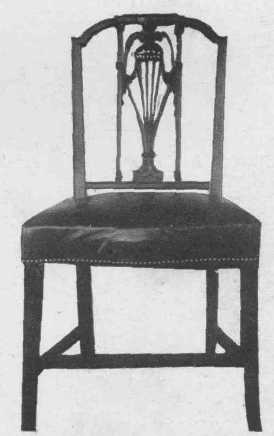
Each artifact found in different stylistic periods has the same concept of intricate design. The artifacts express a more personal position that expresses the owner’s lifestyle. They are symmetrical and balanced with repetitive ornamentation. These artifacts display the owner’s wealth and taste. The importance of these artifacts is that they are functional while being aesthetically pleasing. For example the Desk/Bookcase with Chinoiserie gives this functional yet visually pleasing piece of furniture. The Rococo influenced artifact, has the use of repetition of the flower motif that is symmetrical along both sides of the inside of the cabinet, even though it has a chaotic uncontrolled since of nature, it is still balanced within it. Another example would be the Sheraton Chair; the delicate ornamentation on the back of the chair shows the classical language of swags. Their geometric shapes are contrasted with the back’s ornamentation.


The spaces have the same intricate detail, some heavily ornamented and others simple. But there is still a classical influence in each of them; with geometric patterns, proportions and ornamentation. Each space provides its own contrast within the space; wither it be the contrast of light and dark, or delicate and mass, or even the contrast of the palette of the room with the contrast of the furniture within it. For example in Holkham hall saloon, the rosettes within the octagons create a dynamic texture that borders the top of the room through repetition. One could say that it took inspiration from the coffered ceiling from the pantheon and used the same technique of texture within its cieling. This texture adds to the contrast between the walls and ceiling.

The building themselves reflect past times. They mimic the classics by having classical ornamentation on the porticos. For example, Monticello and Chiswick have gotten inspiration from the villa rotunda, both having a dome on top of a square. The only difference is that both take risks into adding more geometric shapes. The buildings become more focused on geometric symmetry rather than decorating the exteriors. Drayton Hall is another example of the classics expressed in the exterior. The use of the Doric and Ionic orders to emphasized the entrance by the contrast of the materials.The classical orders and language were present in each place and stylistic time period.


[2] Linked to Europe, the ARTIFACTS, SPACES, BUILDINGS, and PLACES of the American colonies echo closely their design forebears. Selecting evidence from all four scales for both the American Georgian periods, TRACE the common design ancestry across the Atlantic Ocean in the Neo-Palladian and Late Georgian periods of England and the Louis XVI/French Provincial period in France. ARTICULATE the implications of copying from Europe for the American colonies. Use the principles and elements of design as defined for this class in your response. Explicitly tie the Roth reading to your analysis, using at least one cited quote. [10 points possible]

To a new world, a new set of rules? When the colonist left their homeland of England, Spain, France, Germany and Holland they brought with them what they knew, architecture, design and craft from the time in which they had left. They brought the influence in which they already grown to understand and the one that they only precedents they had. They only designed for the need of function and from that the beauty of them attached to them.
The artifacts in general were handcrafted out of wood; they used local materials that were available to them. They were very functional and the detail had the sense of boundaries. The artifacts are very symmetrical, and the ornamentation was repetitive, to create balance.
The spaces in general seemed to serve as a multifunctional room, some being more public than others. The color palette in each space had contrast and some central focus. The space was to show the wealth of the person.
The buildings themselves were influenced by the ancestry origin. This also had to deal with the local materials that were available to them. For example, adobe, which was used in Santa Fe, would not have been used in New York City, just because the material itself was not commonly found there.The colonist had trouble putting what they knew to their new environment. They had to change and modify certain things to fit their needs.
[3] From the Hersey/Freedman reading, DESIGN and POST a labeled floor plan of a possible Palladian villa inspired by Girolamo Frescobaldi’s Balletto Terzo found online at this site:http://www.metmuseum.org/toah/hd/renm/hd_renm.htm select the link on the left side of the page with Frescobaldi’s name under multimedias [5 points possible]


As I was listening to the music, I noticed that there was repetition throughout it. Then in the reading it was listed that Palladio liked using ratio's in his floor plans. So I decided to use the perfect square with the ratio of 1:1 and place them side by side, them from there I Placed a rectangle with a ratio of 2:3, then to finish it the repetition of the the three 1:1 ratio square. From this concept of placing squares side by side the floor plan emerged.

[4] Using the resources at the weblink below, SPECULATE about whether you believe that the architecture and design in the Baroque period stands as a form of social performance in the theatre of the world. Support your response with examples from class and the assigned readings. [5 points possible] http://fathom.lib.uchicago.edu/2/10701023/

“The world is a stage” a metaphor in which the baroque period embraced. The baroque interiors were filled of dramatic theatrical illusions that transported you from the world that you inhabit into the world in which is created. This world was created through the contrast of light, shade and shadow that were represented by painting, and statues and lighting in the interiors.
An example of a baroque interior with dramatic lighting is The Hall of Mirrors in the Palace of Versailles. The mirrors reflect the lighting of the interior across the windows, where the natural light penetrates the space. The gold gilded statues also allow the light to shimmer throughout the space. The light illuminates the vaulted ceiling bringing the paintings to life. Creating this never-ending source of light and depth in nature through the paintings.


An example of theatricality is the Trevi Fountain; this fountain provides a sense of movement in which the viewer is engaged into the stillness of the statues in contrast to the moving water. The water also provides this hearing aid along with the visual aid of movement. The statues themselves are life like almost seeming as if they were to breathe and move at any moment along with the water.

Baroque itself became the greater theatre stage that people would have to take a second glance. Its soul purpose was to engage the viewer and create this moment of awe, inspiration, and transport the mindset to a different place. Just like theatre baroque was the drama queen of the stylistic periods.